Power BI interview questions
Complete scenario-based Power BI question bank with full detailed answers, organised by difficulty. Click any question to open its answer.
📅 Last updated: August 2026
🟢 Easy — 6 questions
EasyQ1. What did you do with your project and what are your roles & responsibilities?
In my project, I worked on building an interactive Power BI dashboard for a retail business to analyze sales performance, customer behavior, and product demand. My key responsibilities included:
Data Extraction & Transformation: Collected data from multiple sources like SQL databases, Excel, and cloud storage. Cleaned and transformed the data using Power Query.
Data Modeling: Created relationships between Fact and Dimension tables and implemented Star Schema for optimized performance.
DAX Calculations: Developed complex DAX measures for KPIs like Total Sales, Profit Margins, and Year-over-Year Growth.
Report & Dashboard Design: Designed visually appealing and user-friendly dashboards with slicers, drill-throughs, and interactive visuals.
Performance Optimization: Used Import Mode for better speed and optimized DAX queries for efficiency.
Collaboration & Deployment: Published reports to Power BI Service, scheduled data refreshes, and shared insights with stakeholders.
EasyQ2. What are the transformations used in your project?
Removing Duplicates: Ensured unique records for accuracy.
Changing Data Types: Converted columns into appropriate formats (e.g., text to date, numbers to currency).
Splitting Columns: Used Split Column for separating full names into first and last names.
Merging Queries: Combined multiple datasets for a unified view.
Adding Custom Columns: Created calculated columns like Profit = Sales − Cost.
Unpivoting Data: Converted wide-format data into a normalized structure for better analysis.
Example: While working on a sales dataset, I had to split the "Date Time" column into separate "Date" and "Time" fields for better filtering and analysis.
EasyQ3. What are the different sources you have used in your project?
I have worked with multiple data sources, including:
- SQL Server / MySQL / PostgreSQL / Snowflake: Extracting structured data using SQL queries.
- Excel / CSV Files: Handling offline data.
- SharePoint / OneDrive: Importing data stored on cloud platforms.
- REST APIs: Fetching real-time data from web services.
- Google Sheets: Integrating live data from Google Workspace.
- Azure / AWS / Google Cloud: Connecting to cloud databases and data lakes.
Example: In a financial project, I connected Power BI to an Azure SQL database and merged it with Excel-based budgeting data to create an interactive expense tracker.
Or you can create your own story based on your recent project.
EasyQ5. Difference between Star Schema and Snowflake Schema?
| Star schema | Snowflake schema |
|---|---|
| Dimensions are denormalized — one table per dimension | Dimensions are normalized into sub-tables (Product → Category → Subcategory) |
| Fewer joins, faster query performance | More joins, slightly slower queries |
| Simpler to understand and maintain | Saves storage, but more complex |
| Preferred structure in Power BI | Used when dimension tables are very large |
EasyQ11. There is a report with five visuals and a slicer. If the slicer is changed, only two visuals should be affected; the remaining three should be unaffected. What are you going to do?
Select the slicer visual → Go to the "Format" tab and click "Edit interactions" → Set the desired interaction for each visual → Exit the "Edit interactions" mode.
EasyQ12. There are 2 pages in a report. Page 1 has a Country slicer. If country is changed on page 1, page 2 should automatically be impacted too. How will you do it?
Select the country slicer → Open the Sync Slicers pane from the View tab → Check the Sync boxes for both pages (Page 1 and Page 2).
🟡 Medium — 5 questions
MediumQ4. You have sales data from multiple regions stored in different tables (Sales, Products, Customers). How would you design a data model in Power BI for efficient reporting?
- Use a star schema design with a central fact table (Sales) and dimension tables (Products, Customers, Regions).
- Create relationships between the fact table and dimension tables using primary/foreign keys (e.g., Product ID, Customer ID).
- Ensure relationships are single-directional and avoid circular dependencies.
- Use DAX to create calculated columns or measures (e.g., Total Sales = SUM(Sales[Amount])).
Star Schema Implementation:
1. Fact Table (Sales):
- Contains all transactional data (sales records)
- Includes foreign keys to dimension tables
- Stores quantitative measures (sales amount, quantity, profit)
2. Dimension Tables:
- Products: Product ID, Name, Category, Subcategory, Price
- Customers: Customer ID, Name, Segment, Region, Contact
- Dates: Date ID, Full Date, Day, Month, Quarter, Year
- Regions: Region ID, Country, State, City, Postal Code
A star schema simplifies data modeling and improves query performance. Power BI's engine is optimized for this structure, enabling faster aggregations and filtering.
MediumQ9. Data Modeling Case: Sales data and customer data are in separate tables. How would you model this to analyze customer purchase behaviour?
Load the Data: Import the sales data and customer data tables into Power BI. Establish relationships: identify the CustomerID as the common key between the two tables. In the "Model" view, create a relationship by connecting the CustomerID column from the Sales Data table to the CustomerID column in the Customer Data table.
Data Structure: Sales Data Table contains columns like SaleID, CustomerID, ProductID, SaleDate, and Amount. Customer Data Table contains columns like CustomerID, CustomerName, Age, Gender, and Location.
Create Visualizations:
- Total Sales by Customer: a bar chart showing the total amount spent by each customer.
- Sales Over Time: a line chart displaying sales trends over time for each customer.
- Customer Demographics: pie charts or bar charts illustrating sales distribution by customer age, gender, and location.
Utilize DAX for Advanced Analysis: create measures using DAX (Data Analysis Expressions) to calculate total sales and sales by specific customer attributes for deeper insights. By following these steps, you can effectively model your data in Power BI to gain meaningful insights into customer purchase behaviour.
MediumQ13. Report consists of many visuals and some of the visuals are loading very slowly?
Systematic approach — diagnose first, then fix the biggest offender:
- Performance Analyzer (View tab) → refresh visuals → sort by duration → identify whether time goes to DAX query, visual display, or "other"
- Reduce data size: remove unused columns/tables, filter old history, lower cardinality (no unique IDs/timestamps in visuals)
- Optimize calculations: measures instead of calculated columns; avoid iterator-heavy DAX (SUMX over huge tables, nested FILTER) where a simple filter argument works
- Star schema: single-direction relationships, integer keys — the engine is built for this shape
- Limit visuals: 5–10 per page max (every visual = separate queries); replace visual-level filters with page filters; reduce interactions between unrelated visuals (Edit interactions)
Interview line: "I never guess — Performance Analyzer tells me exactly which visual and which DAX query is slow, then I fix that specific bottleneck first."
MediumQ15. Imagine you need to visualize year-over-year growth in product sales. What approach would you take to calculate and present this effectively?
To visualize year-over-year growth in product sales, I would first calculate the sales for each product for the current year and the previous year using DAX measures in Power BI. Then, I would create a line chart visual where the x-axis represents the months or quarters, and the y-axis represents the sales amount. I would plot two lines on the chart, one for the current year's sales and one for the previous year's sales, allowing stakeholders to easily compare the growth trends over time.
MediumQ16. You're working with a dataset that requires extensive data cleaning and transformation before analysis. Describe your process for cleaning and preparing the data in Power BI.
For cleaning and preparing the dataset in Power BI, I would start by identifying and addressing missing or duplicate values, outliers, and inconsistencies in data formats. I would use Power Query Editor to perform data cleaning operations such as removing null values, renaming columns, and applying transformations like data type conversion and standardization. Additionally, I would create calculated columns or measures as needed to derive new insights from the cleaned data.
🔴 Hard / Advanced — 7 questions
HardQ6. Your Power BI report is slow. What steps would you take to optimize its performance?
1. Data Model Optimization
Star Schema Design
- Central fact table (e.g., Sales) linked to dimension tables (e.g., Products, Customers).
- Ensures efficient filtering and reduces storage overhead.
Column & Row Reduction
- Remove unused columns (especially high-cardinality text fields).
- Filter out unnecessary historical data (e.g., keep only the last 3 years).
Relationship Optimization
- Use integer keys (not text) for joins (e.g., Product ID instead of Product Name).
- Set single-directional cross-filtering (dimension → fact).
- Avoid bi-directional relationships unless absolutely necessary.
2. DAX & Calculation Optimization
- Measures > Calculated Columns — measures compute at query time (dynamic); calculated columns consume memory.
- Replace
SUMX(withSUM(when possible for better performance. - Optimize time intelligence: use
TOTALYTD/DATESYTDinstead of manual date filtering; pre-calculate rolling metrics (e.g., Rolling 12M Sales) in the data source if possible. - Avoid expensive functions: replace nested
CALCULATEwithSUMMARIZEorADDCOLUMNS; useDISTINCTCOUNTsparingly — consider pre-aggregating in SQL.
3. Data Source Optimization
- Query Folding (Power Query): ensure transformations (filters, joins) push back to the source (SQL, etc.). Use View Native Query to verify folding.
- Storage Mode Selection: Import Mode — best for small–mid datasets (fastest in-memory queries). DirectQuery — for large/real-time data (but slower visuals). Hybrid — aggregate tables in Import + details in DirectQuery.
- Incremental Refresh: for large fact tables, refresh only new data (e.g., WHERE Order Date >= TODAY() − 30).
4. Report-Level Optimization
- Visual & page limits: max 5–10 visuals per page (each visual runs separate queries). Use bookmarks or drill-throughs instead of overcrowding.
- Filter efficiency: apply page-level filters before visual-level filters; use slicers with "Single select" to reduce DAX overhead.
- Other tips: disable interactions between non-linked visuals; use static images/icons instead of shape visuals.
5. Advanced Techniques
- Aggregation tables: pre-summarize data (e.g., daily sales by region) for faster queries.
- Calculation groups (Tabular Editor): reuse measure logic (e.g., MTD/QTD/YTD) without DAX duplication.
- Performance Analyzer: use View → Performance Analyzer to identify slow visuals/DAX.
Optimizing the data model, DAX, and report design ensures faster load times and better user experience.
HardQ7. You have a large dataset that updates daily. How would you implement incremental refresh in Power BI?
- In Power Query, partition the data using a date column (e.g. Order Date).
- In Power BI Desktop, enable Incremental Refresh in the dataset settings.
- Set parameters for
RangeStartandRangeEndto define the refresh window. - Configure the incremental refresh policy (e.g., keep 2 years of historical data and refresh the last 7 days daily).
Incremental refresh reduces the amount of data processed during each refresh, improving performance and reducing resource consumption.
HardQ8. A client wants to see the distribution of their customer base by age group and purchasing behaviour. How would you create a segmentation analysis with interactive filtering?
- Create an Age Band calculated column (e.g. 18–25, 26–35, 36–50, 50+) or a separate segmentation table.
- Build measures for purchasing behaviour — purchase frequency, average order value, total spend.
- Use a scatter chart (spend vs frequency, coloured by age band), bar charts by segment, and slicers for interactive filtering.
- Add drill-through to a customer-detail page for deeper insights on any segment.
HardQ10. How would you handle a situation where your Power BI report is performing slowly? What steps to diagnose and fix?
To handle a situation where a Power BI report is performing slowly, you can:
- Optimize your data model by removing unnecessary columns and tables.
- Use relationships and filtering carefully to minimize the amount of data processed.
- Avoid using complex DAX calculations in visuals; instead, create calculated columns or tables if needed.
- Use aggregate tables or pre-aggregated data to reduce the volume of data processed in visuals.
- Ensure that your data source is optimized for performance, such as indexing important columns or partitioning large tables.
- Use Power BI Performance Analyzer to identify and troubleshoot performance bottlenecks in your report.
Or, step by step:
- Check Data Volume: large datasets can slow down your report. Try to reduce the amount of data by filtering or aggregating it.
- Optimize Data Model: remove any unnecessary columns or tables. Use appropriate data types and relationships.
- Review DAX Calculations: simplify complex DAX formulas. Avoid using too many calculated columns or measures.
- Manage Visualizations: limit the number of visuals on a single report page. Use simpler visuals when possible.
- Reduce Query Load: use "Query Folding" to push operations back to the data source. Make sure your queries are efficient and optimized.
- Enable Performance Analyzer: in Power BI Desktop, go to "View" → "Performance Analyzer." Run it to see which visuals or queries are taking the most time.
- Optimize Data Refresh: schedule refreshes during off-peak hours. Ensure incremental refresh is set up if possible.
- Improve Power BI Service Settings: ensure your Power BI workspace is in the correct region. Check for any limitations or restrictions on the service.
HardQ14. You are a data analyst for a global e-commerce company. You need to analyze marketing campaign performance across regions and identify campaigns with the highest ROI, plus how customer acquisition cost (CAC) varies by region and campaign. How would you build this report?
- Bring campaign spend, conversions and revenue data together; model campaigns, regions and dates as dimensions.
- Create DAX measures:
ROI = DIVIDE([Revenue] − [Spend], [Spend])andCAC = DIVIDE([Spend], [New Customers]). - Build a matrix of campaign × region with ROI and CAC, a map or bar chart for regional comparison, and trend lines over time.
- Add slicers for region/campaign/date and drill-through to campaign-level detail so stakeholders can find the highest-ROI campaigns instantly.
HardQ17. Your organization wants to incorporate real-time data updates into their Power BI reports. How would you set up and manage live data connections?
To incorporate real-time data updates into Power BI reports, I would utilize Power BI's streaming datasets feature. I would set up a data streaming connection to the source system, such as a database or API, and configure the dataset to receive real-time data updates at specified intervals. Then, I would design reports and visuals based on the streaming dataset, enabling stakeholders to view and analyze the latest data as it is updated in real-time.
HardQ18. How do you work with large datasets in Power BI?
When dealing with large datasets in Power BI, the primary challenge is the size of the data, which can affect performance, making the report slow to load and refresh. Managing and visualizing such a vast amount of data requires efficient handling to avoid timeouts and performance degradation.
One of the strategies I use is to upload a subset of the data into Power BI Desktop initially. For example, if I have data spanning five years, I might start by uploading only six months of data. This speeds up the development process on the desktop.
Next, I use the Power Query Editor to filter and aggregate data. This includes removing unnecessary columns, filtering rows to include only relevant data, and aggregating data at a higher level. For instance, if detailed transaction data is not necessary, I might aggregate daily sales data to monthly sales data before loading it into Power BI.
For extremely large datasets, I use DirectQuery mode, which allows Power BI to directly query the underlying data source without importing the data into the Power BI model. This keeps the Power BI model lightweight and leverages the processing power of the database server. However, this requires a well-optimized database and efficient query performance at the source. Sometimes, I use a combination of Import and DirectQuery modes, known as composite models. This approach allows for flexibility by importing critical, smaller tables into the Power BI model and using DirectQuery for larger fact tables.
I ensure that the data model is optimized by creating appropriate relationships and using measures efficiently. Reducing the complexity of DAX calculations and ensuring that the model only includes necessary tables and relationships helps maintain performance.
By employing these strategies, I can manage large datasets efficiently, ensuring that my Power BI reports are responsive and performant.
50 Real-Time Power BI interview questions
Questions asked in real interviews, covering Service, licensing, gateways, refresh and day-to-day work. 📖 Explore more — click on this link (Medium) →
EasyQ1. Which database did you use in your project and how do you connect it with Power BI?
Name what you actually used — SQL Server, PostgreSQL, MySQL, Oracle, or cloud ones like Azure SQL / Amazon Redshift / Snowflake.
Connection: Home → Get Data → choose the connector → enter server & database → choose authentication (Windows/Database/OAuth) → pick Import or DirectQuery → select tables and Load/Transform.
EasyQ2. Did you use a cloud database / warehouse? How does it connect?
Example answer: "Yes — Snowflake." Power BI has a native Snowflake connector: Get Data → Snowflake → server URL + warehouse name → sign in. Other routes: dedicated connectors (BigQuery, Redshift, Databricks), ODBC drivers, or APIs when no native connector exists.
MediumQ3. What is Microsoft Fabric and how does it relate to Power BI?

Fabric is Microsoft's unified data platform that brings Power BI, Azure Data services and AI together — one SaaS foundation (OneLake) for data engineering, warehousing, real-time analytics and BI. For Power BI users it means: data pipelines and dataflows managed in the same workspace, Direct Lake mode reading Delta/Parquet files at near-import speed, and datasets becoming shared "semantic models" across the org.
MediumQ4. What are Dataflows and how do you use them?

Dataflows are cloud-based Power Query — reusable ETL that lives in the Power BI Service. You build them in a workspace (not in Desktop), connect to sources, clean/transform in the online Power Query editor, and schedule refreshes. Desktop reports then consume the dataflow's tables.
Why they matter: one team cleans the data once, many reports reuse it — no duplicated transformation logic. Note: a dataflow is a collection of tables without relationships/measures; a dataset adds the model layer on top.
EasyQ5. What data cleaning/transformations do you do in Power Query?

- Remove duplicates — select key columns → Remove Rows → Remove Duplicates
- Handle missing data — Fill Down, Replace Values, or filter out nulls
- Fix data types — dates read as text, numbers as text (Transform tab)
- Merge / split columns — full name ↔ first + last; merge queries (joins)
- Filter & sort — remove irrelevant rows early for performance
- Handle errors/outliers — Remove Errors, Replace Errors, conditional logic
Best practices: every step is recorded (self-documenting), keep a cleaning checklist, create reusable custom functions in M, and validate totals against the source after cleaning.
EasyQ6. With scheduled refresh, do you have to re-do cleaning every time?
No. Power Query steps are saved with the dataset — every scheduled refresh re-runs the entire recorded transformation pipeline automatically on the fresh data. You configure frequency/time slots in dataset Settings → Scheduled refresh (a gateway is needed for on-premises sources).
MediumQ7. Some rows/categories are missing in a visual — how do you tackle it?

Checklist: (1) In the field's dropdown enable "Show items with no data" and set numeric fields to the right summarization; (2) check visual/page/report filters that may exclude them; (3) check the relationship — rows without a matching dimension key vanish in related visuals (fix keys or add an "Unknown" member); (4) verify the rows weren't filtered out in Power Query itself.
EasyQ8. You find duplicate rows in a table — how do you solve it?

In Power Query: select the column(s) that define uniqueness → Home → Reduce Rows → Remove Rows → Remove Duplicates. Better: fix at source if possible, and find why duplicates arrived (bad join, repeated loads). To inspect first, use Keep Duplicates to see what will be removed. In DAX-land, DISTINCTCOUNT vs COUNT quickly reveals duplication.
MediumQ9. Import vs DirectQuery vs Live Connection — differences and when to use each?
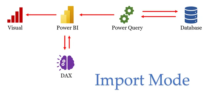

- Import: data loaded into memory (VertiPaq), fastest visuals, full DAX/Power Query — the default for small-to-medium data that fits refresh cycles.
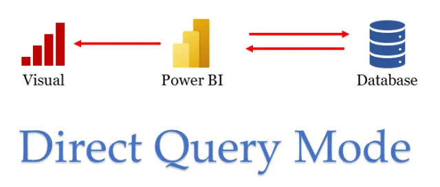
- DirectQuery: nothing imported; every interaction sends a query to the source — near real-time and handles huge data, but slower visuals, limited transformations, source must be strong.
- Live Connection: connects to an existing model (SSAS / Power BI dataset) — the model lives elsewhere; you only build visuals.
Rule: Import for speed, DirectQuery for size/freshness, Live for shared enterprise models. For large datasets, DirectQuery avoids the import size limit — or use a composite model with aggregations for the best of both.
HardQ10. Can we add a calculated column in DirectQuery mode?
Yes — simple row-level calculated columns are allowed in DirectQuery (they translate to SQL expressions), but with restrictions: many DAX functions (especially time-intelligence and functions needing the whole table in memory) aren't supported, and each column adds query cost. Best practice: push such columns to the source (view/warehouse) instead. With a live SSAS connection, the column must be created in the SSAS model and the database processed.
MediumQ11. Pro vs Premium licensing — what's the difference?

- Pro (per user): create, publish and share content; sharing works with other Pro users. Dataset limit 1GB, 8 refreshes/day.
- Premium Per User (PPU): Pro + premium features (larger models 100GB, 48 refreshes/day, paginated reports, more compute) — content shareable with other PPU users.
- Premium Capacity (per organization): dedicated capacity; content in Premium workspaces can be consumed by free-license users — the standard choice for wide distribution in big companies.
HardQ12. How do you handle large datasets? What are the capacity limits?
Limits: Pro 1GB · PPU 100GB · Premium capacity up to 400GB (large dataset format) — and columnar compression means that maps to terabytes of source data.
Strategies: remove unused/high-cardinality columns, aggregate at the needed grain, incremental refresh, DirectQuery for the overflow, composite models + aggregation tables (summary imported, detail on DirectQuery), and monitor memory in Desktop while developing.
MediumQ13. Calculated column vs Measure — the classic question

Calculated column: computed row-by-row at refresh, stored in the model (uses RAM), lives in one table, evaluated in row context — use for values you need to slice/filter by.
Measure: computed at query time based on the current filters, stored nowhere, belongs to the whole model, evaluated in filter context — use for aggregations (sales, %, ratios).
Interview line: "Columns are facts about a row; measures are answers to questions." Default to measures — they're lighter and dynamic.
MediumQ14–15. What are parameters in Power Query and how do you use them?
Parameters are named, editable input values used inside queries — server names, file paths, date ranges, thresholds.
Create: Power Query Editor → Manage Parameters → New (name, type, default). Use: reference the parameter in filters or the Source step (e.g. swap Dev/Prod servers, or RangeStart/RangeEnd for incremental refresh). In the Service, parameter values can be changed in dataset settings without editing the PBIX — that's their real power.
EasyQ16. What is a slicer in Power BI?
A slicer is an on-canvas filter visual — users click values (region, year, category) and every interacting visual on the page filters instantly. Variants: list, dropdown, date range, numeric range, hierarchy slicer. Slicers can be synced across pages (View → Sync slicers). Difference from the Filters pane: slicers are visible, self-service filtering for report consumers.
EasyQ17. Types of filters in Power BI?
- Visual / Page / Report-level filters — the Filters pane hierarchy
- Manual & auto filters — user selections and fields auto-added to the pane
- Include/Exclude — right-click data points to include or exclude them
- Drill-down filters — navigating a hierarchy (Country → State)
- Cross-filter / cross-highlight — clicking one visual filters others
- Drillthrough filters — carry context to a detail page
- URL filters — pre-filter a Service report via query string
- RLS filters — row-level security applied per user role
MediumQ18. Same data type but different column names — can we create a relationship? And same names but different types?
Different names, same type: YES — relationships work on values, not names (CustomerID ↔ Cust_Key is fine as long as values match).
Same names, different types: NO — Power BI requires compatible data types on both sides; a text "101" won't relate to a numeric 101. Fix the type in Power Query first. Also remember: the "one" side should contain unique values.
MediumQ19. What is RLS and what are its types?
Row-Level Security restricts which rows a user can see.
Static RLS: fixed rule per role — [Region] = "West"; simple but needs one role per value.
Dynamic RLS: one rule that adapts to the logged-in user — [Email] = USERPRINCIPALNAME() against a user-mapping table; scales to thousands of users.
Setup: Modeling → Manage Roles → define rule → test with View As → publish → assign members in the Service (dataset Security). RLS applies to Viewers, not workspace members/admins.
MediumQ20. What are bookmarks and drillthrough, and how do you use them?
Bookmark: a saved snapshot of a page's state (filters, slicers, visual visibility, sort). Combine with buttons + the Selection pane to build toggle views (chart ↔ table), pop-up filter panels, and story navigation. Create via View → Bookmarks → Add.
Drillthrough: right-click a data point (say, a customer) → jump to a dedicated detail page automatically filtered to that customer. Setup: build the detail page, drag the field into "Drill through" in the Visualizations pane; a back button is added automatically.
HardQ21. What is incremental refresh and how do you apply it?

Incremental refresh refreshes only new/changed partitions instead of the whole table — hours become minutes.
- In Power Query create datetime parameters RangeStart and RangeEnd (exact names).
- Filter the fact table's date column between them.
- Right-click the table → Incremental refresh → policy, e.g. "archive 5 years, refresh last 7 days".
- Publish — the Service manages partitions on each refresh.
Works best when the source supports query folding.
HardQ22. What is query folding?

Query folding = Power Query translating your transformation steps into the source's native query (SQL), so filtering/joining happens in the database instead of on your machine. Millions of rows filtered at source vs downloaded then filtered — huge performance difference, and mandatory for efficient incremental refresh.
Check: right-click a step → "View Native Query" (enabled = folding). Steps like custom M functions or index columns break folding — do foldable steps first.
EasyQ23. What is scheduled refresh and how do you set it up?

Automatic dataset refresh in the Service: dataset → Settings → Scheduled refresh → frequency (daily/weekly), time slots, timezone, failure notifications. On-premises sources need the On-premises Data Gateway configured with stored credentials. Limits: 8 refreshes/day (Pro), 48 (Premium/PPU).
EasyQ24. What are alerts in Power BI?
Data alerts notify you when a number crosses a threshold. They work on dashboard tiles of cards, gauges and KPIs: open the tile menu (…) → Manage alerts → set condition (above/below X) → Power BI sends a notification/email when triggered. Great for "tell me when sales drop below target" without opening the report.
EasyQ25. What is a subscription in Power BI?
Subscriptions email you (or others) a snapshot of a report/dashboard on a schedule — daily/weekly/monthly, or on data refresh. Setup: open the report in the Service → Subscribe → choose page, recipients, schedule. Alerts fire on thresholds; subscriptions fire on schedule — a common comparison question.
HardQ26. What is the XMLA endpoint?
The XMLA endpoint exposes Premium/PPU datasets as full Analysis Services models, so pro tools can connect directly: SSMS (manage/query with DAX), Tabular Editor (advanced modeling, calculation groups), DAX Studio (performance tuning), and ALM Toolkit (deployments). Read/Write mode turns Power BI into an enterprise semantic-model platform beyond what Desktop offers.
MediumQ27. What is a gateway and what are its types?
The On-premises Data Gateway is the secure bridge between the Power BI cloud service and data inside your network — required for scheduled refresh/DirectQuery against on-prem sources.
- Standard mode: installed on a server, shared by many users and multiple services (Power BI, Power Apps, Power Automate) — the enterprise choice.
- Personal mode: single-user, Power BI refresh only, can't be shared — fine for individual use.
- (VNet gateway exists for Azure virtual networks — managed, no installation.)
HardQ28. How is the REST API used with Power BI?
The Power BI REST API lets developers automate and integrate: embed reports/dashboards in custom apps, trigger dataset refreshes programmatically, create/clone workspaces and reports, push data into streaming datasets, and pull audit/activity data. Auth is via Azure AD (service principal or user token). Typical analyst mention: "we trigger refresh from our ETL pipeline via the API once data lands."
MediumQ29. What is Power BI Embedded and how do you share reports with clients?
Embedded puts Power BI visuals inside your own application — customers use your app, not powerbi.com; auth is handled with embed tokens ("app owns data"). Capacity is bought as Azure A-SKUs.
Sharing with clients otherwise: publish an app (cleanest), direct share, or Publish to web (public link — only for non-confidential data). External users can be invited via Azure AD B2B guest access.
HardQ30. What is a deployment pipeline?
A Premium feature giving you Dev → Test → Production stages for workspaces: develop in Dev, deploy content forward with one click, compare stages, and use deployment rules to auto-swap data sources/parameters per stage (Dev DB in Dev, Prod DB in Prod). It's application-lifecycle-management for BI — no more manually republishing PBIX files to the prod workspace.
MediumQ31. How do you optimize a dashboard and dataset?
Dataset: star schema, remove unused & high-cardinality columns, integer keys, measures over calculated columns, incremental refresh, aggregations, ensure query folding.
Report: 5–8 visuals per page, page/report filters instead of visual-heavy filtering, reduce interactions between visuals, avoid huge tables, limit slicers with "Only relevant values".
Process: measure first with Performance Analyzer, fix the top offender, re-measure.
MediumQ32. How do you use Performance Analyzer?
View → Performance Analyzer → Start recording → interact/refresh visuals. Each visual shows time split into DAX query (slow = fix measures/model), visual display (slow = too many data points), and other (slow = too many visuals waiting on each other). Copy the DAX query into DAX Studio for deeper tuning. Golden rule: optimize the slowest visual first.
MediumQ33. What day-to-day challenges do you face and how do you tackle them?
Give 2–3 real ones with fixes:
- Changing requirements: lock KPI definitions in writing before building; use a change log.
- Data quality surprises: validation checks in Power Query + reconciliation against source totals before publishing.
- Slow reports: Performance Analyzer diagnosis → model slimming → aggregations.
- Refresh failures: gateway monitoring, credential rotation calendar, failure alerts to email.
EasyQ34. Which delivery model do you work in — Waterfall or Agile?
Most BI teams: Agile (Scrum) — 2-week sprints, dashboards delivered iteratively, feedback each sprint review. Answer with your reality and one concrete detail: "We work in 2-week sprints with a Jira board; a dashboard ships as MVP in sprint 1, then refined from stakeholder feedback." Mention you can operate in either.
MediumQ35. Which DAX functions do you use in your dashboards?
Group them when answering:
- Aggregation/iterators: SUM, SUMX, AVERAGEX, DISTINCTCOUNT
- Context control: CALCULATE, FILTER, ALL, ALLSELECTED, ALLEXCEPT
- Relationships: RELATED, RELATEDTABLE, USERELATIONSHIP, LOOKUPVALUE
- Time intelligence: TOTALYTD/QTD/MTD, SAMEPERIODLASTYEAR, DATEADD, DATESBETWEEN, CALENDAR
- Logic/variables: VAR/RETURN, SWITCH, IF, DIVIDE
- Grouping/running totals: SUMMARIZE, GROUPBY, and the CALCULATE+FILTER(ALLSELECTED…) running-total pattern
MediumQ36. How do you QC that your KPI outcomes are accurate?
- Understand the KPI definition — formula and business intent agreed in writing.
- Cross-check with raw data — recompute in SQL/Excel and match the dashboard number.
- Validate sources & ETL — data current, pipeline ran, row counts sane.
- Test edge cases — nulls, returns/negatives, month boundaries, timezone issues.
- Benchmark — compare against history and known reports; investigate deviations.
- Check filters/RLS — confirm the number under different slicer states and roles.
- Stakeholder sign-off — business validates before wide release; keep a QC log.
EasyQ37. How do you choose visuals while creating a dashboard?
Match the visual to the question:
- Trend over time → line/area · Compare categories → bar/column
- Part of whole → stacked bar, donut (few categories only)
- Single KPI → card/KPI/gauge · Relationship → scatter
- Two dims + measure → matrix/heatmap · Geo → map · Flow/contribution → waterfall/funnel
Principles: KPIs top-left (eyes go there first), max 5–8 visuals, consistent colors, no pie charts with 10 slices, every visual must answer a business question.
MediumQ38. Import vs DirectQuery vs Live — which is best?

No absolute winner — it's a trade-off triangle: Import wins on speed and features, DirectQuery wins on data size and freshness, Live wins when a governed enterprise model already exists. Interview-safe answer: "Import by default; DirectQuery when data is too large or must be real-time; Live when the company has central SSAS/shared datasets; composite models when I need both."
MediumQ39. Client wants YoY growth for product sales — how do you design it?
Measures:
Sales LY = CALCULATE([Total Sales], SAMEPERIODLASTYEAR('Date'[Date]))
YoY %    = DIVIDE([Total Sales] - [Sales LY], [Sales LY])
Design: KPI cards on top (This Year, Last Year, YoY% with conditional color), a line chart of both years by month, a bar/matrix by product with YoY% conditional formatting (green/red), year & product slicers, and drillthrough to a product detail page. Requires a proper marked Date table.
MediumQ40. Can we create two active relationships between two tables?
No. Only ONE relationship between the same two tables can be active; the rest stay inactive (dotted lines). Activate an inactive one per-calculation with USERELATIONSHIP() inside CALCULATE — the classic case being Order Date (active) vs Ship Date (inactive) to one Date table.
HardQ41. Define bidirectional cross-filtering
A relationship's cross-filter direction set to Both — filters flow dimension→fact AND fact→dimension. Useful for many-to-many bridges and making one dimension's slicer reduce another dimension's list. Dangers: ambiguity in the model and slower queries — best practice keeps Single direction by default and uses Both surgically (or CROSSFILTER() in a specific measure).
MediumQ42. (Gateways revisited) When is a gateway NOT needed?
No gateway needed for pure-cloud sources (Azure SQL, Snowflake, SharePoint Online, web APIs) — the Service reaches them directly. Gateway required whenever the source lives on-premises/behind a firewall, for both scheduled refresh (Import) and DirectQuery/Live connections.
HardQ43. Is it possible to create a calculated column in DirectQuery mode?
Yes, with limits — the DAX must translate to the source's SQL, so only row-scope expressions work (no time-intelligence, no cross-table magic beyond RELATED). Each such column adds runtime cost on every query. Best practice: create it in the source view/warehouse instead, or switch that table to Import/dual in a composite model.
MediumQ44. Difference between duplicating and referencing a query in Power Query?
Duplicate: a full independent copy of the query and all steps — changing the original does NOT affect the copy.
Reference: a new query whose Source = the output of the original — it inherits every change in the original; used to build layered pipelines (raw → cleaned → dimension/fact splits). Note: referencing doesn't reuse computation; the chain re-evaluates unless staged via dataflows.
EasyQ45. What are Merge and Append in Power Query?

Merge = SQL JOIN — combine columns of two tables on a key (Sales + Customer details via CustomerID; choose join kind: left, inner, full…).
Append = SQL UNION ALL — stack rows of same-structured tables (Q1 sales + Q2 sales into one table). Merge widens, Append lengthens.
MediumQ46. How do you optimize the performance of a Power BI report?
- Prefer Import mode; use aggregations for big data.
- Slim the model — drop unused columns, avoid high-cardinality fields, star schema.
- Filter at the source; ensure query folding.
- Efficient DAX — variables, DIVIDE, avoid row-by-row FILTER when a simple predicate works.
- Fewer visuals per page; reduce visual interactions.
- Diagnose with Performance Analyzer and fix the top offender first.
HardQ47. What is Power Query M language and when do you use it?
M is the functional language behind every Power Query step (see it in the Advanced Editor). The UI writes M for you; you write M directly for things the UI can't do: custom functions applied across files, dynamic column logic, conditional source paths, advanced text/list operations. Example: a custom function that cleans 30 monthly files identically. M ≠ DAX: M shapes data before load; DAX calculates after load.
EasyQ48. How do you use themes and custom visuals?
Themes: View → Themes — apply built-in ones or a custom JSON theme file defining brand colors, fonts and visual defaults, giving every report a consistent corporate look instantly.
Custom visuals: import from AppSource (certified ones preferred) or build with the pbiviz SDK/D3.js. Use cases: bullet charts, Gantt, advanced KPIs the default set lacks — but limit them; too many custom visuals hurt performance and governance.
MediumQ49. Power BI Desktop vs Power BI Report Server?
Desktop: the free authoring tool — build models and reports locally, then publish.
Report Server: an on-premises hosting platform for organizations that can't use the cloud (compliance/regulatory) — reports stay on the company's own servers. It needs a special Desktop version (optimized for RS), trails cloud features (no dashboards, limited AI visuals), and comes via Premium or SQL Server EE licensing.
EasyQ50. What are Power BI templates (.PBIT) and how do you use them?
A .PBIT file saves the report's structure without data — data model, queries, measures, visuals, theme. Share it and a colleague opens it, supplies parameter values/credentials, and gets the same report on their data. Perfect for standardized monthly reports and multi-client setups. Create via File → Export → Power BI template.
HardQ51. Advanced DAX functions you've used and how they help performance?
- CALCULATE — the engine of context manipulation; precise filters beat giant table scans.
- VAR/RETURN — compute once, reuse; the single biggest DAX performance habit.
- SUMX/iterators — row-wise math; keep the iterated table small.
- FILTER — powerful but costly; replace with boolean predicates in CALCULATE where possible.
- ALL/ALLSELECTED/ALLEXCEPT — totals and %-of patterns without extra queries.
- KEEPFILTERS, TREATAS, USERELATIONSHIP — surgical context control instead of model rework.
MediumQ52. How do you configure a data gateway for on-premises sources?

- Download & install the On-premises Data Gateway on an always-on server (not a laptop).
- Sign in with the org account and register the gateway.
- In the Service: Settings → Manage gateways → add data sources (SQL Server, file shares…) with stored credentials.
- Grant users permission to use each data source.
- In dataset settings, map the dataset to the gateway → scheduled refresh/DirectQuery now works.
Tips: cluster two gateways for high availability; keep it updated monthly.
EasyQ55. Can two tables have more than one ACTIVE relationship?
No — one active relationship maximum between any two tables (solid line); additional ones are inactive (dotted). Use USERELATIONSHIP in CALCULATE to invoke an inactive one for a specific measure.
MediumQ56. What are Content Packs (and their modern replacement)?
Content packs were bundles of dashboards, reports and datasets shared across an organization (service-provider packs like Google Analytics, and user-created packs). They're deprecated — replaced by Power BI Apps, which do the same job better: a workspace publishes an app; consumers get a read-only, updateable package. In interviews, mention the replacement — it shows current knowledge.
