Tableau Learning
A complete Tableau concepts reference by Mahendra Singh — data sources, joins vs relationships vs blends, live vs extract, dimensions & measures, filters, sorting, sets, calculations, dashboards, file types and more, with the original screenshots included. Read straight through or jump to the topic you need.
📅 Last updated: August 2026
Opening different data types in Tableau
- Tableau can support two type of data sources: from a file(local PC), from a server(from Web)
- By default, Tableau maintains a live connection to your data, so as new source data is added, it can be incorporated into your analysis. A live connection is a direct connection to your data, while a Tableau data extract is a compressed snapshot of data stored locally and loaded into memory.
Methods to join Data in Tableau
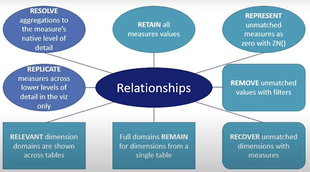
- Relationships are a dynamic, flexible way to combine data from multiple tables for analysis.
- When relating tables, the fields that define the relationships must have the same data type.
- The first table that you drag to the canvas becomes the root table for the data model in your data source.
- You can connect to many data sources to build your relationships. If there is a common field name between the tables involved, then it doesn’t matter if those tables are located in one data source or in different data sources.
- You can't edit relationships after publishing a data source.
- Relationships can be published.
- Relationships are computed locally.
- You can't define new relationships between published data sources.
- Relationships can't be joined on Geographical fields/Calculated Fields.
- Relationship requires at least 1 common field.
- Joins are static.
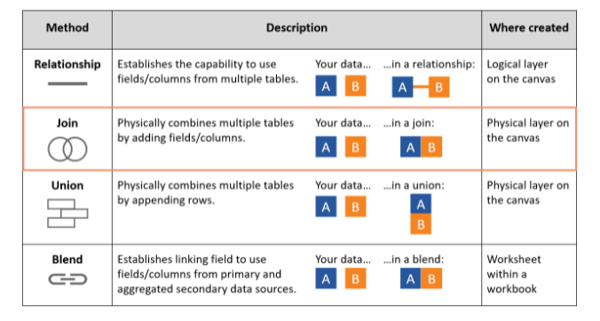
- A join combines the data and then aggregates. A blend aggregates and then combines the data.
- A relationship makes sure all the columns are there from both tables in the view, join doesn’t do that.
- Joining data with different aggregations or levels of detail can cause data duplication.
- cross database join: tables from multiple connections.
- Data from different data source can't be union-ed.
- Blend/Relationship retains the original table structure.
- Blends can't be published.
- Blend is computed as a part of SQL Query.
- join/union will always create a new table
- Cross-database joins require that you first set up a multi-connection data source
- When field names in the union do not match, fields in the union contain null values. You can merge the non-matching fields into a single field using the merge option to remove the null values. When you use the merge option, the original fields are replaced by a new field that displays the first non-null value for each row in the non-matching fields.
- The result of combining data using a join is a table that's typically extended horizontally by adding fields of data.
- physical layer does join union or both
- you can use a union to combine data that has a similar structure so that rows from one table are appended to the rows of another table.
- In Tableau, unions can be created manually or by using a wildcard search.
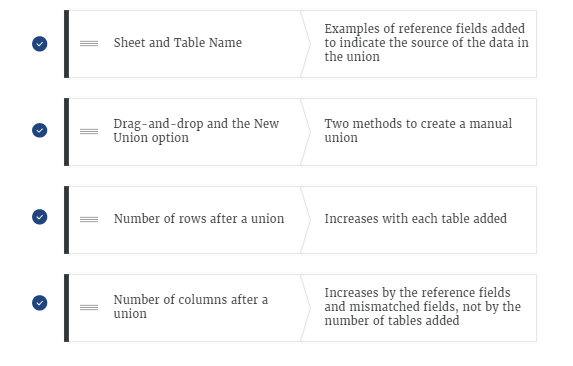
- In a union, Tableau adds reference fields to help you identify the source of the data.
- The other way to create a manual union is by using the New Union option.
- When you create a union in the canvas of the Data Source page, Tableau displays a logical table that is shown in the logical layer.
- This logical table contains the union-ed physical tables.
- If two columns have same purpose but with different values, these can be merged using "match mis-merged field" to get optimal results.
- Data Blending is left-outer join and is worksheet specific i.e. different worksheet can have different blends and it is done through data pane itself.
- Primary will be blue, Secondary will be orange.
- There must be a common dimension between the data sources in a data blend.
- The primary data source will include all values from that data source.
- Whichever table's data is first dragged to sheet becomes primary data blending source.
- All secondary data in blending must be aggregated
- Blends, unlike relationships or joins, never truly combine the data. Instead, blends query each data source independently, the results are aggregated to the appropriate level, then the results are presented visually together in the view.
- Blend requires at least 2 data sources whereas relationship and Join only require single data source.
- One reason you might use blends over relationships is to combine published data sources for your analysis.
- Blends are established individually on every sheet. Because there is no true “blended data source,” only blended results from multiple data sources in a visualization, the blended data cannot be published to Tableau Online or Tableau Server.
- When users connect to Tableau, the data fields in their data set are automatically assigned a role and a type.
- Role can be of the following two types:
- 1) Dimension
- 2) Measure
- Type can be of the following :
- 1) String
- 2) Number
- 3) Geographic
- 4) Boolean
- 5) Date
- 6) Date and Time
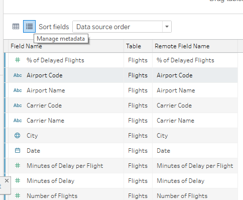
- When using the manage metadata option, when we change the name of a field, it is referred to as "Field name" which was previously referred as "Remote Field Name
Live vs Extract
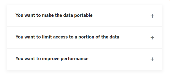
- Live data process queries in source database whereas Extract process queries using Tableau Data Engine.
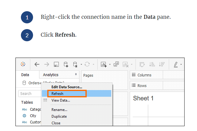
- To refresh the live data:
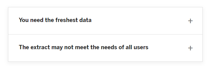
- Live is best choice when you want to leverage a high performance database’s capabilities, or to get up-to-the-second changes in data visualized in Tableau. When we chose this, Tableau maintains a connection to the data source, so data refreshes in the workbook.
- Extract is best choice when we connect to a slow database or when you want to take query load off critical systems. You can choose to import only some of the data and bring in specific elements to the extract.
- Extract file have .hyper extension.
- An extract is only extract for that particular workbook but when it is share to others it will act as live and if we use it on another notebook again it will be live data.
- Extract is not useful for private data as you're saving the data in local system and it can be shared with anyone.
- Tableau treats sheets within Excel as separate database tables.
- Double cylinder means extract data.
- Single cylinder stands for live data.
- A data extract is a saved subset of a data source, with the total amount of extract data determined by using filters and configuring other limits.
- Extract is used when we want to filter our data and save it for future purposes.
- Extract provides additional functionality such as COUNTD.
- Extracts can't update automatically, they can either be manually refreshed or periodically.
- When refreshing the data, you have the option to either do a full refresh, which replaces all of the contents in the extract, or you can do an incremental refresh, which only adds rows that are new since the previous refresh.
- Disadvantages of Extract
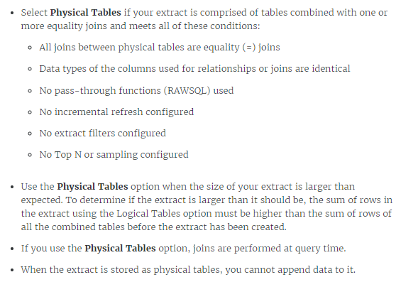
- Tableau can extract data from either logical(Single table) or physical tables(Multiple Table).
- While extracting, we can also extract aggregated measures.
Metadata
- Tableau shows 10,000 preview rows by default.
- To manage metadata quickly, one can chose "manage metadata option".
- Tableau preserves the customizations you make, but it does not change the underlying source data.
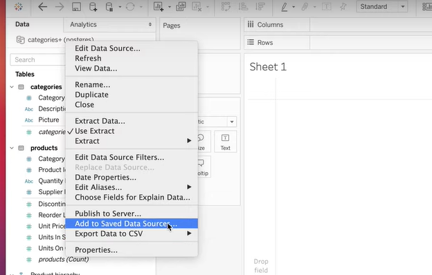
Saving metadata to a .TDS file
Dimension and Measures
- blue color items are discrete because they are categorical
- green color items are continuous because they are numerical
- Dimension + Measures: WHAT?
- Discrete + Continuous: HOW?
- Dimension - Independent variable; Measures - Dependent variable
- A discrete field always create the row header and a continuous field creates an axis.
- A discrete field is blue and a continuous field is green.
- A green pill always be aggregated based on the context.
- A measure can also be discrete and a dimension can also be a continuous value.
- A dimension is always qualitative. and Measure is quantitative.
- A measure can be used as discrete when we don't want axis and just text.
- A measure is something on which we can apply aggregated features such as sum, avg, etc.
- Geographic and Date can be both continuous as well as discrete.
- The dimensions that define how to group the calculation (the scope of data it is performed on) are called partitioning fields. The table calculation is performed separately within each partition.
- The remaining dimensions, upon which the table calculation is performed, are called addressing fields, and determine the direction of the calculation.
- Color and comment is the common attribute for measure or dimension.
- Color palettes can only be defined for Dimensions.
- When you drop a continuous field on Color, Tableau displays a quantitative legend with a continuous range of colors.
- When we drag continuous and discrete fields: we get two different color palettes i.e. categorical and quantitative legends (sequential palette).
- Default properties for Dimensions:
- 1. Comment
- 2. Colour
- 3. Shape
- 4. Sort
- 5. Date Format (For Date Type)
- Default properties for Measures:
- 1. Comment
- 2. Colour
- 3. Number Format
- 4. Aggregation
- 5. Total Using
Measure Values & Measure Names
- The Measure Values field is a measure that contains the values of the measures.
- The Measure Names field is a dimension that contains the names of the measures.
- Measure Names & Measure values works hands in hands. Measure names acts as a labels for measure values.
- Measure names and Measure values could also be used to create 2 or more axis charts.
- The most common use of Measure name and Measure value is to create Text Table(crosstab/pivot tables).
- When we add Measure Values to a view, Tableau creates a Measure Values card that lists the measures in the data source with their default aggregations.
- When we add Measure Names to a view, the measure names appear in the view as row or column headers, depending on whether it is added to Rows or Columns.
- Text tables can have max of Fifty on Rows and sixteen on Columns.
- Adding two or more measures to the same axis automatically adds Measure Names and usually Measure Values to a view.
Creating Folders
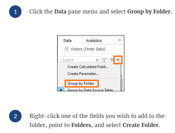
- Folders can be created when we wish to keep some of data together:
- Similarly, to change a dimension to a measure, drag the dimension to the Measures area.
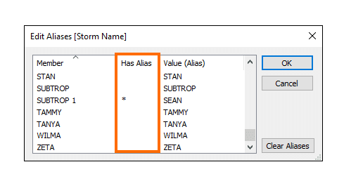
- When we create an alias for an entity, the Has Alias column now has a * to indicate that the member has an alias.
- When we add the field to the view, the alias names will appear as labels in the view.
- Aliases are only for dimensions.
Creating Groups & Hierarchy
- A group(represented by Paper clips) lets you combine several members of a single dimension into a single data point or category type, creating a new dimension field that didn’t originally exist in your data.
- Groups are used to combine high level category using low level.
- Groups in Tableau are represented by a paper clip.
- A hierarchy is an arrangement of data fields in a hierarchical format with an "above" and "below" structure. A hierarchy preserves the ordering, creates drilling capabilities in the visualization, and it can be used over and over. Any type of data can be organized into a hierarchy.
- We can have more one field to more than one hierarchy.
- Category and SubCategory can be grouped using Hierarchy.
- Date Fields are automatically by default in hierarchy.
- Tableau behaves differently when we create groups using labels within the view and using labels in the view.
- Grouping can be done in three ways: from data pane or from views, marks in the views.
- Groups can be made on both dimensions and measures.
- We can also create a new group inside the group.
- We have an option to either view other members as "Other" or by their labels.
- While creating groups within the view, the new group field is instantly used in the view.
- If we group using labels in the view, a new consolidated mark is created. (if include other is unchecked) (by default)
- When we create a group in marks for the first time: (if include others is checked)
- The mark colors are updated in the view.
- A group called "others" is created.
- A group field is created in the data pane.
- A group is selected that combines all selected marks.
Filtering the data
- "Keep only" and "Exclude" are the simplest Filter option available in the view.
- We can also use "Keep Only" and "Exclude" to the headers. If we keep hierarchical fields, then all the further fields would stay in the view.
- Filtering data makes it easier to focus on relevant information in a large dataset or table of data. Filtering does not remove or modify data, it just changes the data that appears in your view.
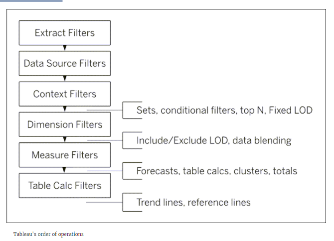
- Extract Filters >>
- Data Source Filters >>
- Context Filters (Sets, Conditional Filters, top N, Fixed LOD) >> (All filters in Tableau are computed independently. If you want one filter to be applied before other filters, make it a context filter so it will be processed first.)
- Dimension Filters(Include/Exclude LOD, Data Blending) >>
- Measure Filters(Forecast, Table Calc, Clusters, Total) >>
- Table Calculation Filters(Trend Lines, Reference Lines)
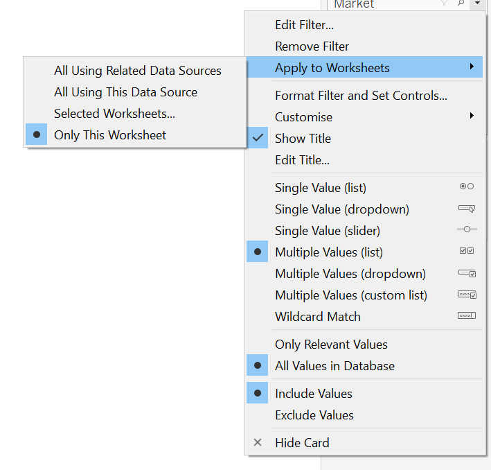
- By default, a filter only applies to the worksheet that it is created in. But you can change that by right-clicking the filter in the Filters shelf, and selecting Apply to Worksheets.
- Measures contain quantitative data, so filtering this type of field generally involves selecting a range of values that you want to include and showing only the values that meet your filter criteria.
- A dimension filter restricts categorical data in your view. The members present in a dimension can be included or excluded using this filter.
- Context filter is an independent filter. Any other filter that you set are defined as dependent filters because they process only the data that passes through context filter. It applies the filter to the base level i.e. sheet level.
- The objective of using context filter is to boost the performance of filters on large dataset. It is usually on categorical data.
- Context filter can be only dimensional filter.
- Context filters also helps to create a dependent numerical or top N filters.
- To speed up context filters: do the data modelling before filtering, use bins for continuous dates.
- The normal filter might contain the intersection of 2 filters(if applied) that's why we use context filter to see the view out of that intersection. Simply go to a filter and right click and "Add to Context".
- Extract Filters are only available for Single Table option.
- Multiple filters works with AND clause.
- you can filter data across multiple primary data sources. You cannot filter data across secondary data sources.
- To apply a filter to multiple data sources, simply define the relationship between two data sources it is not necessary for both fields to have same field name but contain something in common. Once the relationship is defined, go to any sheet and put a filter and toggle it to apply to all worksheets.
- The filters restricted to current worksheet is called LOCAL FILTERS.
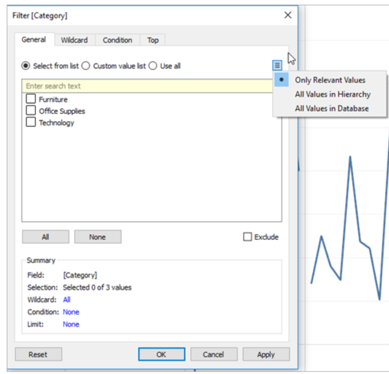
- Filters for dimensions includes: General, Wildcard, Condition, Top.
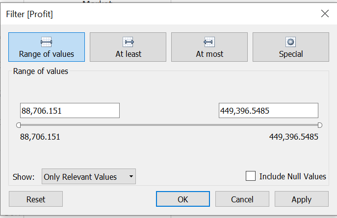
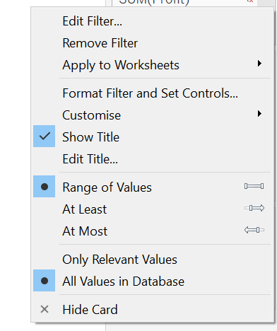
- Filters for measure allows you to work on different variations such as sum, average, median, std deviation etc. It includes: Range of Values, At least, At Most, Special(includes null values and all).
- If you have a large data source, filtering measures can lead to a significant degradation in performance.
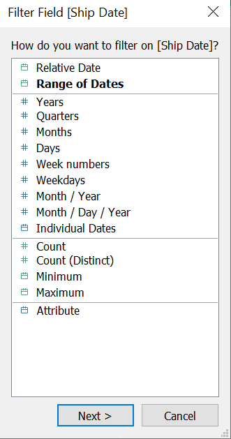
- For Date filters, we get same options as dimension and measure filters for dimensional and measure date respectively. It also allow us to chose from Dimensional and measure dates.
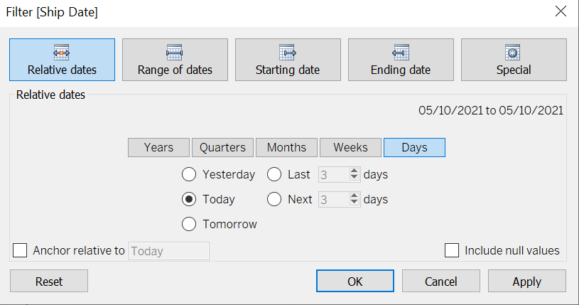
- We can filter dates in: Filter Relative Dates, Range of dates, Starting date, ending dates, Special.
- To create a table calculation filter, create a calculated field, and then place that field on the Filters shelf.
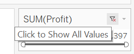
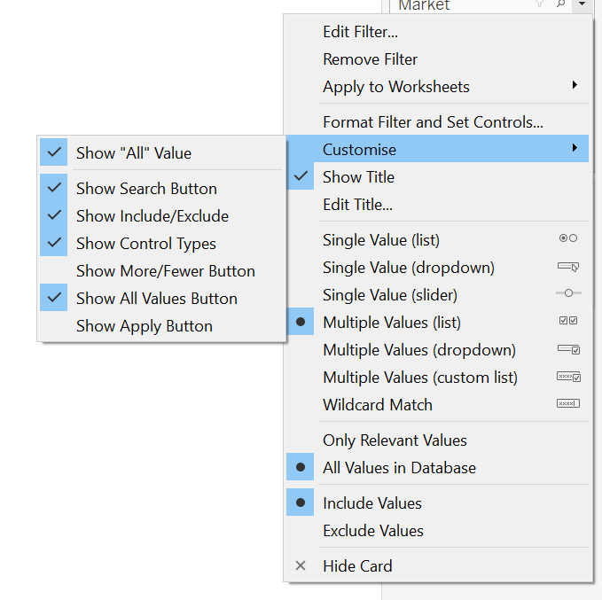
- Format Filters & Set Controls: Helps to format the color of filters.
- All values in Database: If we chose this, all values will be shown from database regardless of other filters.
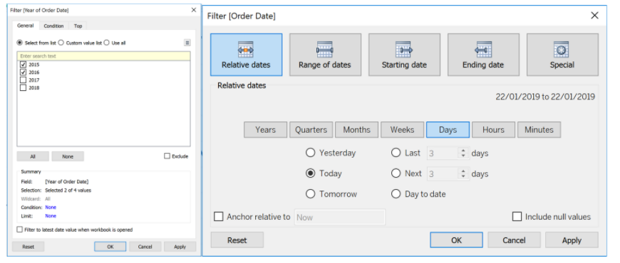
- We can add filters to multiple sheets either by right clicking fields on filter shelf or using toggle button in legends.
- Date part vs Date value filter:
Granularity
- Granularity only depends on dimensions.
- Aggregated measures are granularized based on some dimensions.
- Fields with limited quantities can be brought to label, shape or color. But fields with high quantities can only be brought to details and that add level of detail i.e. granularity.
Sorting
- Computed sorts organize the data by applying rules and are dynamic.
- Manual sorts organize the data by manual rules.
- Sorting is done on dimensions only.
- Data can be sorted using single click options from an axis, header, or field label. One click to sort ascending, two click to descending and three click to clear sorting.
- Sorting can also be done through toolbar, through headers or through column shelf.
- To sort manually, drag and drop fields.
- Once the items are manually sorted, they'll not change even if we refresh our data.
- A nested sort considers each pane independently and sorts the rows per pane. Nested sort is most useful when you want to sort within a category of items in a view.
- Nested sorts are correct within the context of the pane, but don’t convey the aggregated information about how the values compare overall.
- Sorting from an axis/Toolbar gives a nested sort by default.
- Sorting from a field label gives a non-nested sort by default
- Enabling any other type of sort (Field, alphabetic, or Nested) clears the manual sort we create.
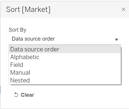
- Data source order means, the data would follow the natural sort.
- Field lets you choose on which field do you want to sort.
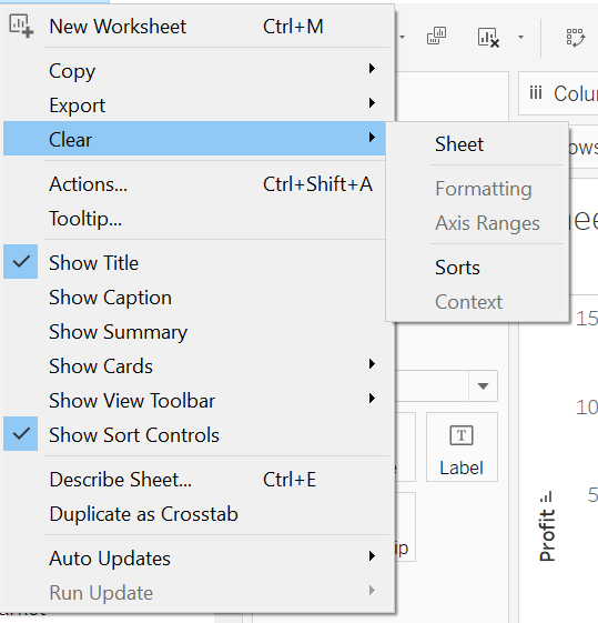
- To remove all the sorts:
- To disable sort, uncheck "Show Sort Controls" in Worksheet menu.
Sets
- Sets are useful for viewing and highlighting data that meet specific criteria.
- Sets can only be created on dimensions.
- Sets can actually be called as pre-computed filters as they subset data.
- There are two types of sets: Static (made from view) and dynamic (made from data pane).
- For Dynamic Set
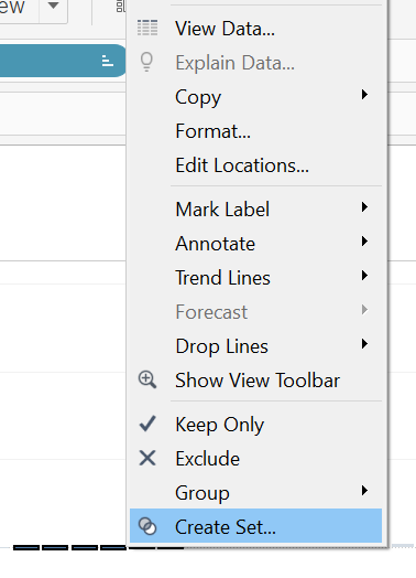
- For static set
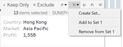
- We can add/remove data points from a set:
- You can only display a set control for dynamic sets—not fixed sets.
- a set can be used on any dimension.
- a set is itself a dimension
- Sets are used to compare, and Filters are used to filter out the data.
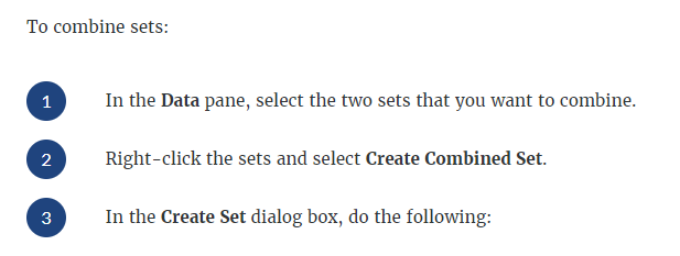
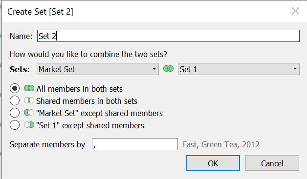
- When you combine sets, you create a new set containing either the combination of all members, just the members that exist in both, or members that exist in one set but not the other.
- To combine two sets, they must be based on the same dimensions.
- Sets can also be used as filters, drag them to filter shelf.
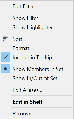
- To show individual members of set:
- Right click on set >> Show members in set
- Filter and sets are same, but sets are more of a permanent filters.
- Filter will change the view, set will add a dimension to the view. (i.e. filter will remove the points, but here we will get both in and out points)
- We can combine two sets to compare them.
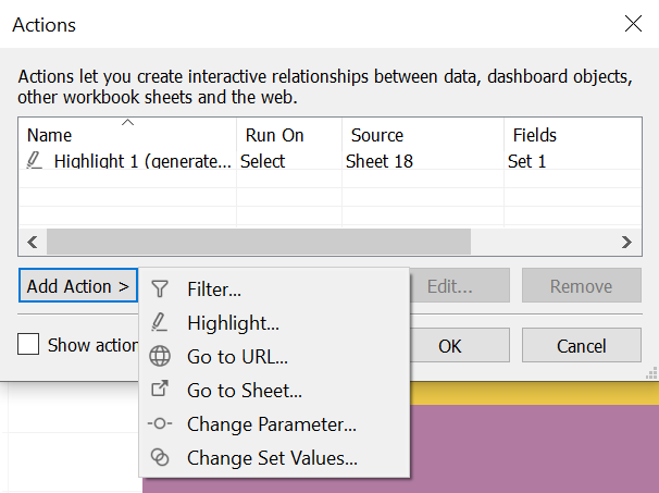
- GROUP vs SET
- Filters only apply to the current worksheet. Sets can be reused throughout the workbook. Since sets become part of the metadata, any workbook connected through that saved data source (or .tds file) can also utilize its functionality.
- You can rename the "in/out" labels to use labels of your choice. You do this by using an alias or a calculation which uses an IF Then ELSE statement.
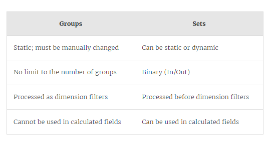
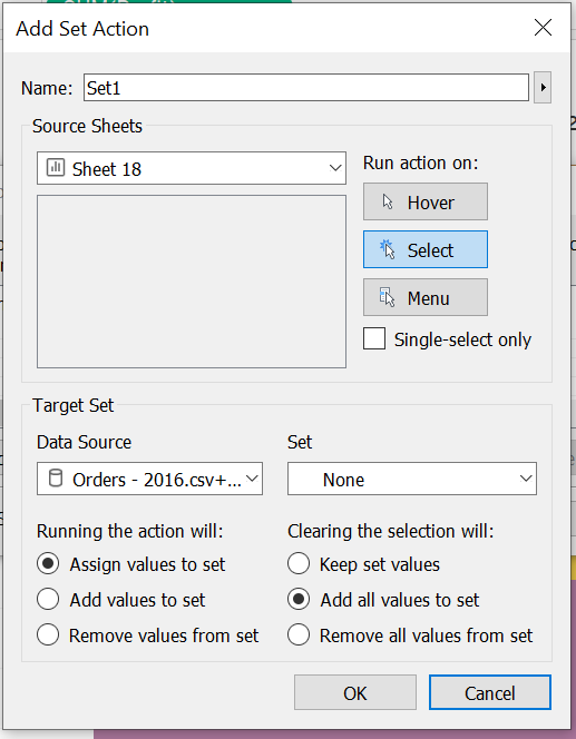
- Set actions can be enabled from Worksheet > Actions
Date Value & Date Parts
- If a date field is used as a date part in a view, then Tableau displays the field in blue and shows headers for each discrete part.
- Date part is discrete.
- Date value is continuous.
- If a date field is used as a date value in a view, then Tableau displays the field in green and shows the values along an axis that is a continuous range of time.
- Date part is individual while Date Value is always wrt time/year.
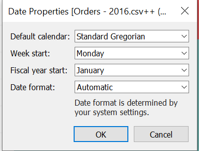
Date Properties
- Right click on data source and chose Date Properties.
Dual Axis and Combined Axis charts
- Dual axis charts have two axes for the measures and one for the dimensions. Dual axis charts are useful for showing how two measures compare to each other.
- In Dual Axis chart, we can only synchronize second axis wrt first and not vice-versa.
- Convert Dual-Axis chart to Combined axis chart by hiding the second axis.
- Plot a chart between a dimension and measure and then to create a dual axis chart, just drag the second measure to the right of chart. (Multiple marks are created here) (It can only compare 2 measures together)(dual axis chart = combination chart) (Can be created with measures as well as dates)
- Dual and combined axis charts use two measures and one or more dimensions.
- In combined axis chart, both the charts are visualized on same axis. Plot a chart between dimension and measure and then to create a combined axis chart, just drag the second measure to y axis. (Only 1 mark is there)(we can compare more than 2 measures) (combined axis chart = blended axis chart = shared axis chart)
- dual axis chart can be created using dates(when done continuous)
Text-Tables (Pivot Tables / Cross tabs)
- A highlight table is useful for showing data values while also revealing key values—such as the highest or lowest—which may also reveal patterns in the data.
- Color, Text and Mark type are used to highlight tables.
Pie Charts (2-5 categories only)
- The basic building blocks for a pie chart are the Pie mark type, a dimension on Color, and a measure on the Angle option on the Marks card.
- Pie charts are effective for showing part-to-whole comparisons with a dimension that has a small number of categories
Analytics Pane
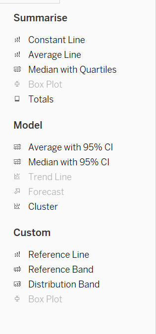
- We can add a constant line for a specific measure, for all measures, or for date dimensions.
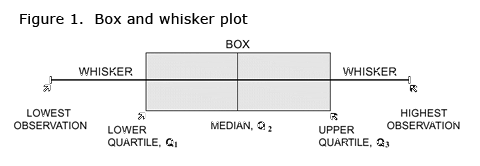
- Box plots are combination of reference lines and reference bands.
- Box plots are used to check if our data have any outliers or not.
- You can add box plots for a specific measure or for all measures. The scope for a box plot is always Cell.
- To create box plot, take a quantified entity, check off the aggregated measures and in show me chose box plots.
- Box plot represents interquartile range.
- A Reference Distribution plot can be along a continuous axis.
- You can add reference lines, bands, distributions, or (in Tableau Desktop but not on the web) box plots to any continuous axis in the view.
- A Reference Band can be based on two fixed point.
- Adds totals to the view. When you add totals, the drop options are Subtotals, Column Grand Totals, and Row Grand Totals.
- Trend lines can be Linear, Exponential, Logarithmic, Polynomial.
- Forecasting is only possible with at least one measure.
- Forecasting is always done on continuous date fields.
- When we increase our precision in forecasting, the range is increased.
- Trend lines can only be used with numeric or date fields.
- We can also add a custom reference line, reference plot, box plot, distribution band.
- A trend line requires 2 measures on opposing axes, or a date and a measure on opposing axes.
- We can add a trendline and reference line to scatter plot.
Parameters
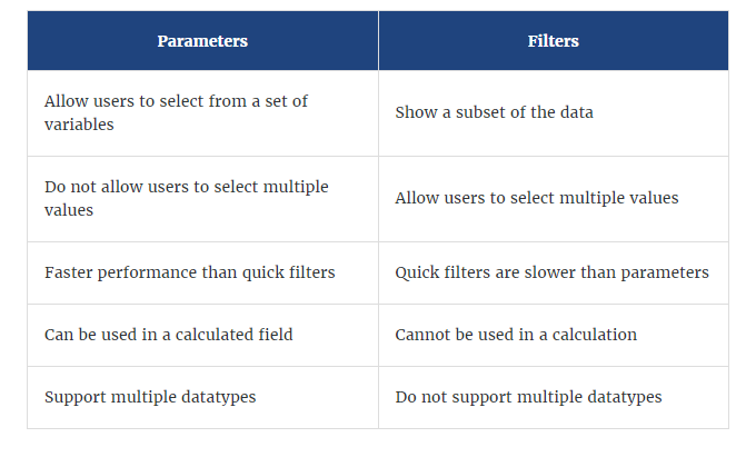
- Parameters simply control a variable’s value, they are only useful once that value is incorporated into something else such as a filter, set, reference line, or a calculated field.
- Parameters aren’t the same as filters, but they can be used to customize filters.
Tree-maps
- Tree maps require 1 or more dimensions and 1 or 2 measures.
- Tree maps don't use rows and column shelf but rather use only marks pane & hence, don't have axes. But to increase LOD we can also add rows and columns.
- We can also add more colors using second measure in our tree map.
- A tree map requires size, color and detail.
Calculations
- It can be either across the pane, down the table or for the cell.
- A calculation, also known as a formula, includes some or all of these components:
- Fields
- Functions
- Operators
- Parameters
- Comments
- Clicking Apply allows you to preview how the calculation changes the data in the view. Clicking OK saves the calculation.
- for the first data value, there is no previous value to compare it to. Hence, it appears as NULL.
- Save an ad-hoc calculation (calculation created in row/column shelf) for use in other workbook sheets, CTRL + drag it from the view to copy it to the Data pane
- To fix any calculation, put {} around the calculation. And the calculation will be same for the whole table i.e., constant value for the table and can't be broken by any measure or dimension.
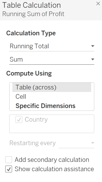
- Table calculations are used on data in the view.
- Table calculations can be saved and doesn't automatically occurs in data pane.
- To create a quick calculation, add a measure to the view and right click chose "Quick Table Calculations".
- We can also edit a quick table calculation.
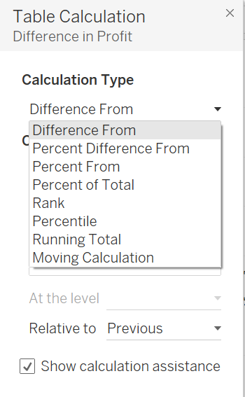
- We can also create a Table Calculation, right click on a measure in view and click "Table Calculation".

Tableau Dashboards and Stories
- When you modify a sheet, any dashboards containing it change, and vice versa. This is because data in sheets and dashboards is connected. With a live connection, both sheets and dashboards update with the latest available data from the data source.
- Actions can be triggered either through: Hover, Select, Menu
- 3 types of dashboard actions - select, hover and menu. Hover is best for highlighting, select for filtering. Menu action is added to the tooltip and user can decide whether to run that action or not (best for URL actions)
- Filter action uses the data from one view to narrow down data in another to help guide analysis.
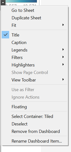
- Floating layout might overlap in Dashboards.
- These are safe URL prefixes allowed - HTTP, HTTPS and FTP. for dashboard actions.
- To save space or improve its proximity to another item, you can float a view, filter, legend, text, image, web page, or even a layout container.
- Dashboard can be made on Phone, Tablet, Default, Desktop.
- Tooltips are a great way to provide additional context in a dashboard without using additional text or marks in a view.
- The viz in the tooltip is a static image, not an interactive viz.
- If you use Show Me in the source sheet to change the view structure, you will reset all tooltip edits, including Viz in Tooltip references.
- Tableau supports two types of animation: Sequential and Static.
- A story is a sheet that contains a sequence of views and dashboards that work together to convey information.
- Delete option is disabled for a sheet if it is used by either dashboard or a story.
- Most important visualizations are placed on upper left corner.
- We can't add both a Dashboard and a Worksheet at the same time to a Story Point in Tableau.
- To customize links based on your data, you can automatically enter field values as parameters in URLs.
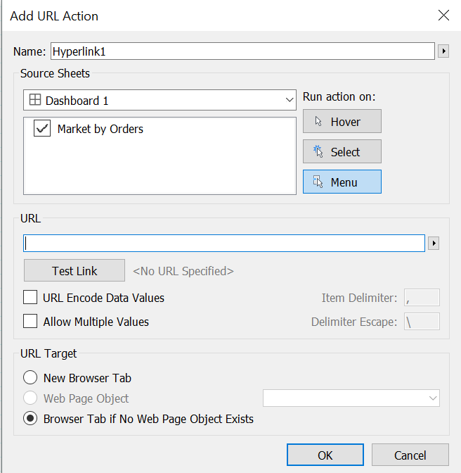
- On a dashboard, you can specify an ftp address only if the dashboard doesn't contain a web object. If a web object exists, the ftp address won't load.
- Tableau supports 9 objects:
- Drop down in Dashboard objects:
- Legend highlighting helps to stand the data highlighted.
- We can export dashboard/story image in jpg, png, emf, bmp format using Dashboard>Export Image and Story>Export Image.
Saving the data
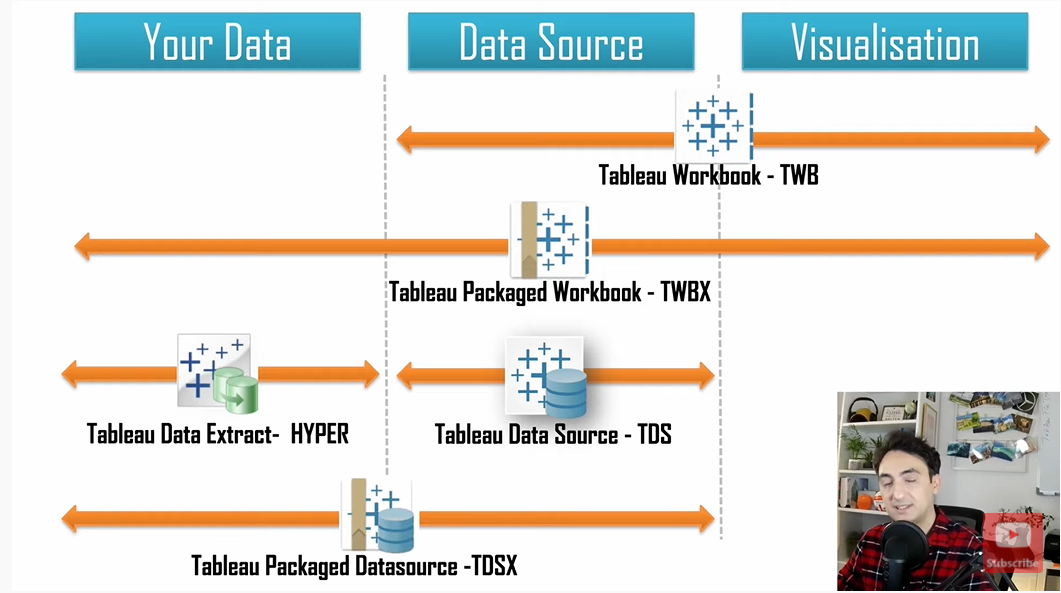
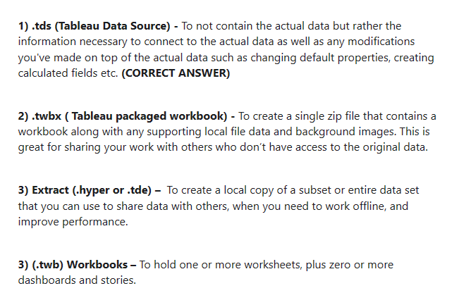
- .twb extension will save the file without the data, and will crash once the data files have been moved out of there original place.
- .twbx extension will save the file along with the data. It can be shared as ppt, pdf or image.
- .tds extension will save the data model. (only model not charts) (except for parameters everything is saved)
- .tdsx extension will save the data model along with the data.
- .hyper/.tde extensions is used to save extract file and can be shared over email or any other medium. It can also be used to work offline and improve performance. (basically used for extract data)
About .tds files
- Tableau Desktop saves your customizations to a local file in the Tableau data source (.tds) format. You can reuse the .tds file in different workbooks and share the .tds file with other users.
- Locally saved Tableau data source (.tds) files appear under Saved Data Sources, on the Connect page.
- .tds includes models(not data) and every customization except for login information and parameters.
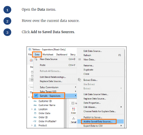
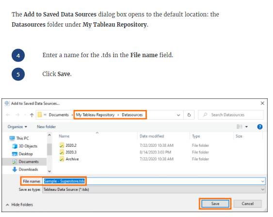
- To save .tds file:
- Saving the .tds to the Datasources folder under My Tableau Repository makes the .tds available from the Connect page under Saved Data Sources.
- We can share the .tds file with others so they can benefit from the customizations and get right to analysis
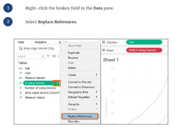
- Renaming fields in data source requires you to replace references.
Charts
- Adding a dimension helps to create a stacked bar chart from bar chart.
- To create a stacked bar chart, simply drag another dimension to the marks card.
- By default, the shape that a Heat map uses is a "Square".
- A histogram looks like a bar chart but groups values for a continuous measure into ranges, or bins.
- Bins can only be created on measure. But we can create bins from dimensions too - they just have to be numeric.
- Area charts are typically used to represent accumulated totals over time and are the conventional way to display stacked lines.
- A Pareto chart is a type of chart that contains both bars and a line graph, where individual values are represented in descending order by bars, and the ascending cumulative total is represented by the line.
- A bullet graph is useful for comparing the performance of a primary measure to one or more other measures.
- Tree maps are effective at showing part-to-whole comparisons of data sets with long tails in their distribution and many levels of dimensions.
- When we create a bin from measure a new dimension is added.
- Tree chart can be changed to a text cloud or bubble chart by just changing the shape of marks.
- For creating variable size bins we use Calculated Fields.
Animations
- The animations are disabled by default and is of 0.3s.
- The default simultaneous animations are faster and work well when showing value changes in simpler charts and dashboards.
- Sequential animations take more time but make complex changes clearer by presenting them step-by-step.
- It can also be enabled for whole workbook
Geographical Fields
- We can convert textual fields to geographic data
- We can change geographical role of a dimension.
- Map types - Symbol Map and Filled Map.
- Geographic region data type is also a string.
Tableau Products
- Tableau Server
- Tableau Online
- Tableau Public Server (Visual Blog)
- Tableau Desktop (paid desktop tool)
- Tableau Public Desktop (free desktop tool)
- Tableau Reader (helps to view tableau dashboards created by tableau desktop)
- Tableau Prep Builder (mini ETL tool)
- Tableau Reader is a free desktop application that you can use to open and interact with data visualizations built in Tableau Desktop.
Exporting and Downloading Content
- You can generate a snapshot in one of the following formats: Image(.png), PDF, or PowerPoint.
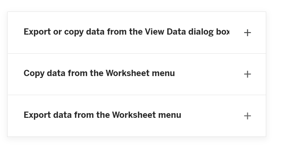
- We can copy visualization from Worksheet and Dashboard by going to their respective menus.
- We can also download visualization from Worksheet and Dashboard by going to their respective menus.
- To download in PDF: File >> Print to PDF.
- To download multiple views use either PDF or PPT.
- We can export the data either in csv or MS Access format.
- We can also export the data either in cross tab or .csv format with options as summary, full data, full data with columns.
Extra Points
- Higher R2 value(0-1), Lower p value(≤0.05), a better chart.
- R-Squared value closest to 1 is the best trend model for a view.
- It is possible to join a maximum of 32 tables in Tableau.
- The Average function does not treat null values as zeros.
- When exporting a worksheet as an image in Tableau, png, jpg, bmp file formats are available. But when we copy the image it is in TIFF format.
- Values are always aggregated at level of granularity of the worksheet.
- All .tds files are saved in My Tableau Repository >> My Data Sources.
- Disaggregating data can be useful when you are viewing data as a scatter plot.
- By default, measures placed in a view are aggregated. Mostly you'll notice that the aggregation is SUM, but not ALWAYS.
- We can disable highlighting option for entire sheet.
- We can't connect Google Firebase to Tableau Desktop.
- Values are always aggregated at level of granularity of the worksheet.
- Aggregation can be put on both measure and dimension.
- Totals can be done either through Analytics pane or Analysis menu.
- Parameters and Sets can be used in calculations while Filters and Group can't be.
- Measure names and Measure values CANNOT be deleted in Tableau like other columns can. These are auto-generated. Calculated Fields, and Number of records can both be deleted.
- Clustering is a technique in Tableau which will identify marks with similar characteristics.
- Dimensions and Measures are always present in the Data Pane. Sets and Parameters get on to the data pane conditionally when you add them.
- Ctrl + M creates a new worksheet.
- Ctrl + D + M is used for Dashboard actions.
- A TDS file will only save a parameter if it is referenced by a calculated field.
- You can aggregate measures or dimensions, though it is more common to aggregate measures.
- The aggregation function attr() returns a * sign when there is more than one value in all the rows in the group.
- Calculated fields are processed in the database
- When using Min() or MAX() if either argument is null then the function returns null.
- Aliases can be created for the members of discrete dimensions only.
- Grand totals cannot be applied to continuous dimensions.
- Tableau uses the Standard Gregorian calendar by default.
- We can use Data Interpreter to clean/organize the data in Tableau.
- To concatenate fields, they must be of same data type. However, there is a workaround which we can use - Type casting.
- Aggregation for measures includes: Sum, Average, Std Devn, Count, Countd, Max, Min, Percentile. etc
- Aggregation for dimensions include: Max, Min, Count, Countd
- We can add totals from Analytics Pane and Analysis menu.
- Orange-Blue diverging palette is an excellent choice for both colour blind and sound-vision people.
- To concatenate fields, they must be of same data type.
- By default, aggregation is performed on row-level detail.
- Data can be exported to an MS Access DB (Data is the option name ) or csv file.
- Packaged workbooks have no data security and so data can be seen without any encryption.
- Tableau reader is free and less powerful version of Desktop with limited viewing
- capabilities. Doesn’t have the full editing features - can sort etc only basic things. Can
- open .twbx files.
- Aliases can be created for the members of discrete dimensions only. They cannot be created for continuous dimensions, dates, or measures.
- When using a published data source, you cannot create or edit aliases.
- Be sure to change to correct data types before creating extract.
- Percentile is available both in aggregation and calculation.
- For calculations, we can't combine an aggregated and disaggregated value.
- Joined tables are merged into single table.
Note: This page is a quick-reference summary of Tableau concepts. For the full 140+ question interview bank, head to the Tableau interview questions section, and for downloadable PDFs visit the Resource Hub.
